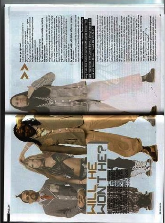
The first aspect of this magazine that I noticed was the extremely large full length image of the artists, ‘black-eyed peas’. This image is very effective as they are all wearing around the same colours of clothing which makes them associate with each other. One thing that stands out to me is that one man is in clear colouring and further in front of the other members of the band. This suggests that this article is about him without even looking at the title. The other members have been photo shopped to look as if they are part of the background.
The gold arrows are effective because it gives us the idea that we have to read on to find the answer and the answer lies straight after the arrows. The writing is set along the right hand
side which makes it easier for the reader as it will be the last thing the
reader will look at on the page.
Overall, I like this double page spread as it is very simple yet effective. It lets you read for left to right and is easy to follow. The image has been edited to highlight the main point of the article. It doesn’t look as if there is a lot of writing so the consumer would want to read it without thinking it’s too long and boring. These pages keep the buyers interested and give them a lot to look at. The best thing I like about the magazine is that it is all linked together to make it understandable.
the main headline has been put across the image which makes it stand out against the image still. They have done this by using a white background just for the main headline. The colours used are gold and grey in which the words, ‘will he?’ are in gold. This suggests a brighter and better option as the wont he is negative and grey is associated with darkness. There is a question asked which makes us feel included into the article and make us want to know what he will do or won’t do. I find this question very effective. Under the main headline, is a strap line which gives the readers a preview of the main article and helps to reader know if they would want to read on or not.
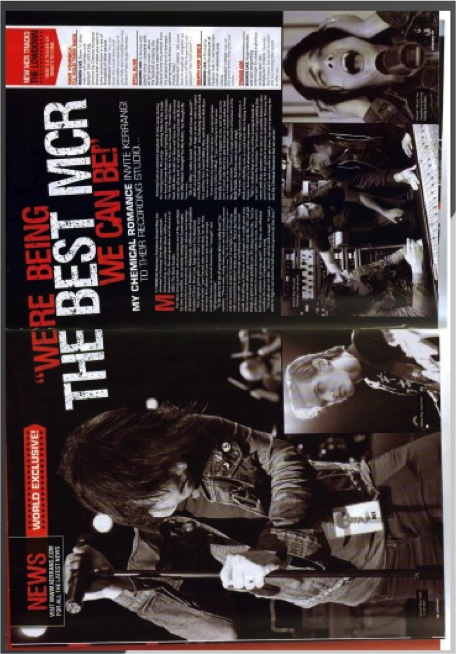
The cover line is very eye catching in the sense of the bold red and white writing. The text is very large and spreads across the middle of the pages. They use a quote which makes us believe in the article being told by the band ‘my chemical romance’. Giving a quote in the cover line draws the reader in to believe that the truth is being told.
The main image is of a member of the band which makes us think that he will mainly do the talking or that he is the lead singer. The image is him at a live concert so it doesn’t look too published and over edited. The image is in sepia which gives an antique and vintage look to him. He is wearing casual clothes which identifies their fashion and that their main concentration for the audience should be singing, not clothing
Instead of just using one main image, they have used3 little ones as well which shows a journey they have been on to make their songs. One of them shows the band members together in the studio, front his the audience can easily tell how many are in the band instead of looking at their faces individually.
On the main text, they have used a drop cap which makes the writing look more intriguing. It is keeping to the colour scheme by using red for the drop cap. The text is in two small blocks which doesn’t look a lot to the reader so will entice them into reading.
I like this idea of a side banner as it stands out which a white background to advertise songs to come. They give a brief overview of the track which will attract the reader because they would like to know about the new songs and if they are worth listening to. The strip is at a slightly slanted angle which gives the band an edgy unique feel. The sub headings are in red which makes each of the titles of songs stand out clearly
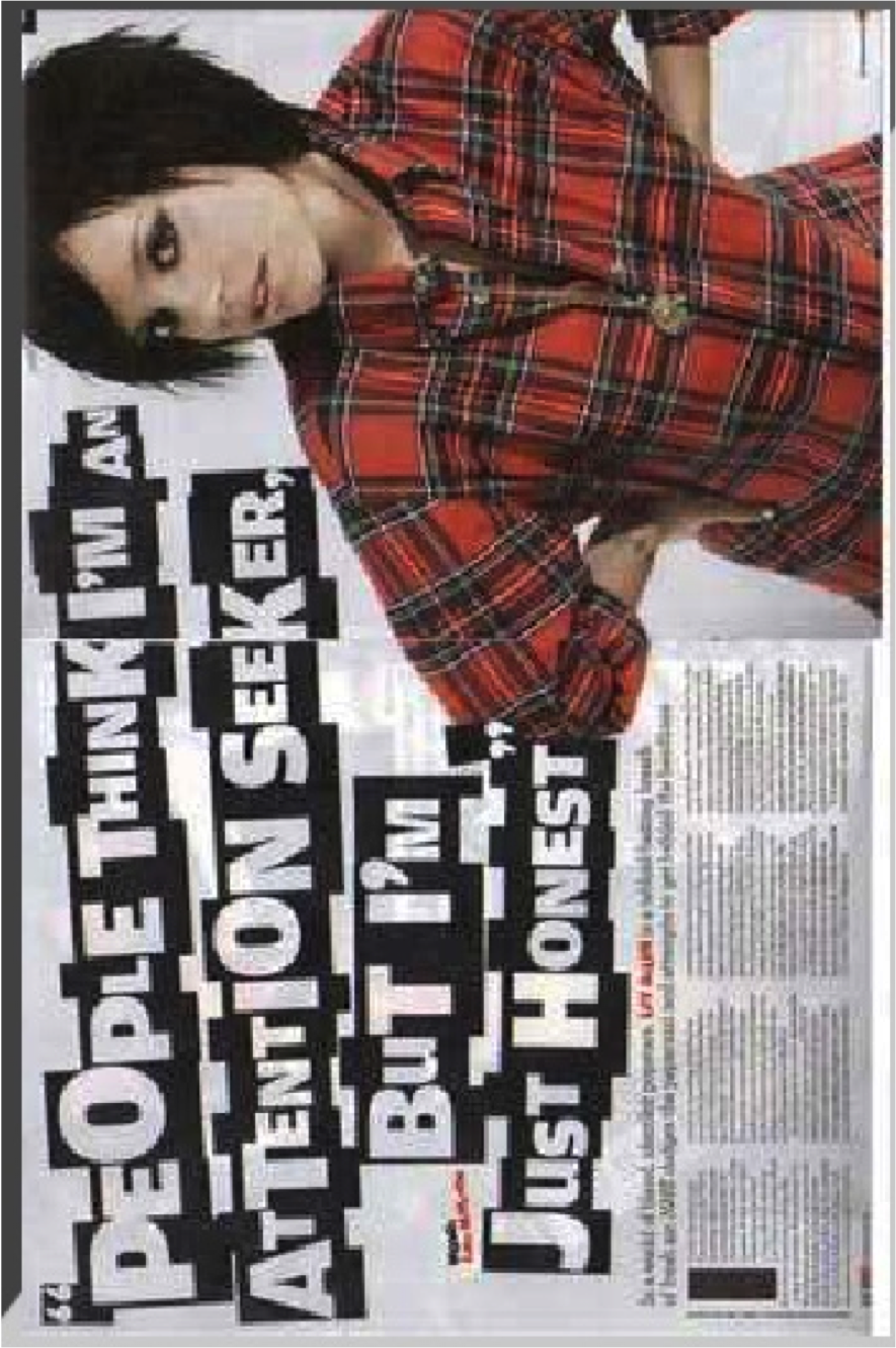
The main image is of Lily Allen herself in an awkward, unusual position. She is taking up nearly the whole of the second page which makes her stand out and makes it easy for the reader to understand who the main person in this article is. In the image, it looks as if she is coming out of the magazine a little. Also it looks like she is listening to something or she wants to be listened to. This could relate to her wanting to be listened to through this article. Lily Allen wears the brightest colour on the page which makes her stand out against all the rest of the page. She is the first thing my eyes were attracted too.
Overall, this double page spread is more about focusing on the photo of Lily Allen and the main cover line. This is all to draw the reader in and attract them to the smaller text. The cover line just quotes the main and most interesting part of the story. I noticed that a few aspects of her would have been edited, like her face. For example, her skin has maybe been made smoother and clearer to what it is naturally.
The strapline gives an idea and preview of the article with further detail to the headline. They used the colour red on her name to match it to her as she is wearing a red shirt; in which they can be linked. The text is set in four blocks which makes it look like not a lot of writing for the reader. They have used a big ‘I’ to start off the writing which makes it look as if Lily Allen is speaking herself and make it more personal and intrigues the reader into what she has to say. They made it bigger so that it can easily been seen against the text.
I like the way the headline stands out and looks cut out from a newspaper. It gives a very strong quote that would attract them reader into the article. She speaking personally which makes the reader believe in the words and the article more, they become more interested and intrigued by what she has to say and not the magazine writers. The headline takes up most of the room on the page to make it stand out more effectively. They have chosen the colours to make it seem simple and just like writing normally. They have not used bright colours which suggest it will not be a happy subject. The writing is shaped around the image to highlight the image more.